Build and use Metrics dashboards

Track traffic, errors, latency, cost, usage, and quality—and narrow a change to the requests behind it.

The Metrics dashboard turns request telemetry into trends and breakdowns. Use it to spot a change, identify the model, provider, customer, prompt, or API key involved, and then inspect the matching logs or traces.

The dashboard summarizes request-level telemetry; it is not a count of root traces. One trace can contain several LLM requests, so Requests and Traces can show different totals.

What you can answer

Use the dashboard to answer questions such as:

  • Did request volume, error rate, latency, or cost change?
  • Which model, provider, prompt, customer, or API key contributed most?
  • Is a regression widespread or limited to one cohort?
  • Is the change in typical performance or only in the slowest requests?
  • Which logs or traces should you inspect next?
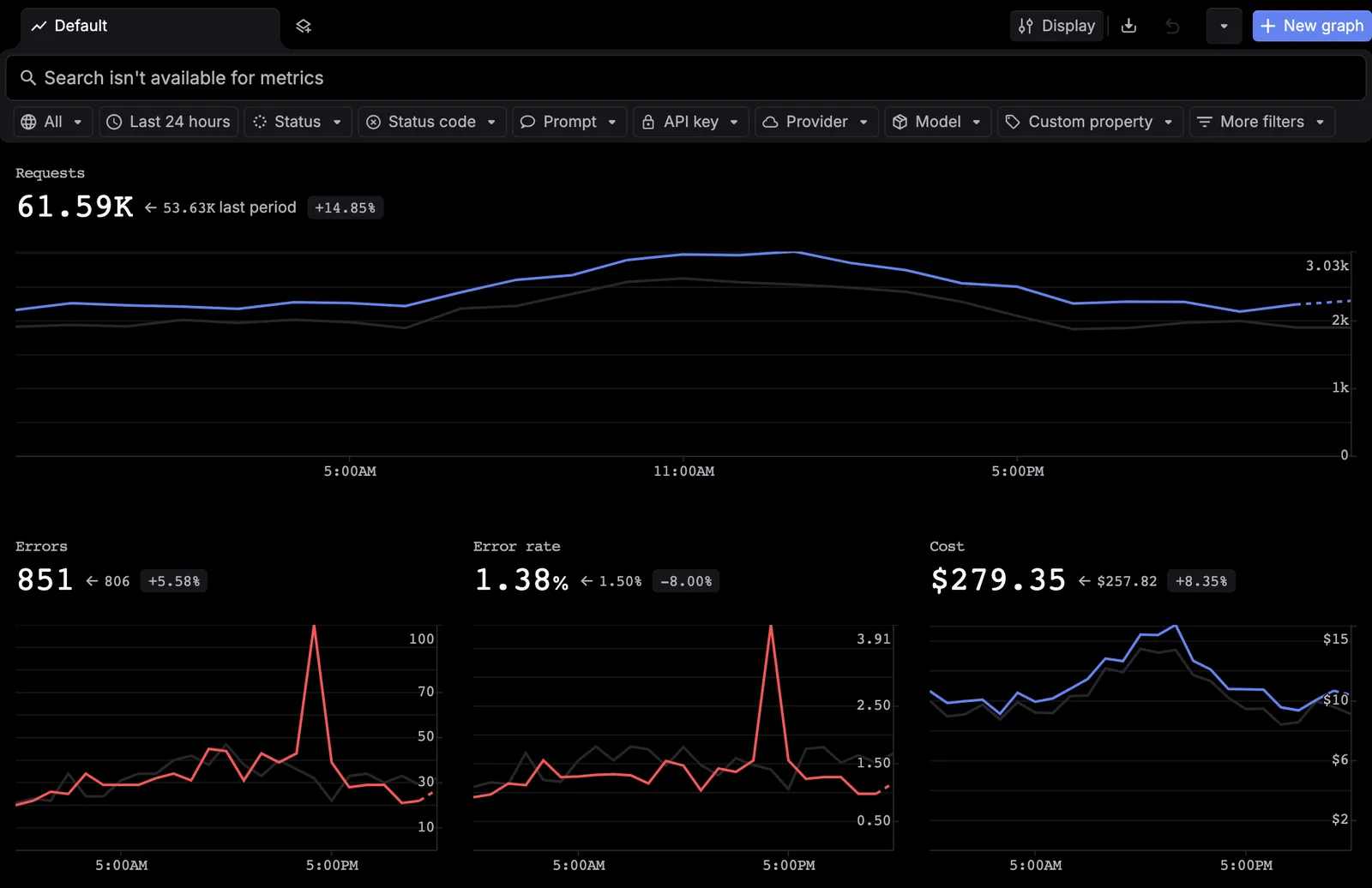
Respan Metrics dashboard with populated request, error, error-rate, cost, model, prompt, and latency charts over the last 30 days.
The default Metrics dashboard shows request volume, errors, error rate, cost, model and prompt breakdowns, and latency charts for one time range.

Read the overview

Every graph uses the time range and global filters selected in the toolbar. Summary values show the aggregate for that range; where a previous-period value and percentage appear, use them to understand how the current range changed from the preceding comparable period.

Start with these signals:

SignalWhat it tells youUseful next breakdown
RequestsRecorded LLM request volumeModel, provider, prompt, API key, or customer
ErrorsNumber of request records marked as errorsModel or provider
Error rateErrors as a percentage of requestsModel, provider, or a custom property
CostRecorded model cost in the selected rangeModel, provider, API key, or customer
LatencyTime to complete a requestP50 for typical latency; P95 or P99 for slow-tail latency
TTFTTime to first token when streaming timing is availableModel or provider
TokensInput, output, or total token usageModel, prompt, API key, or customer
ScoresResults produced by configured evaluatorsEvaluator, model, or prompt

Use a total to confirm that something changed, then use a ranked breakdown or grouped graph to find the cohort responsible.

Choose the investigation window

1

Open the time-range picker

Select the current range in the upper-right toolbar.

2

Choose a preset or exact interval

Use a preset—from Last 5 mins through Last 30 days—or enter exact start and end dates and times. Presets such as Today, This week, and This month are also available.

3

Choose the timezone

Select Local when investigating in your current timezone or UTC when coordinating across regions and comparing against server timestamps.

4

Apply the range

Click Apply. Use the refresh control when you need to fetch the latest values; its menu also controls automatic refresh.

Respan Metrics time-range picker showing calendar controls, exact start and end times, presets, Local and UTC options, and the Apply button.
Use a preset or define an exact investigation interval in local time or UTC.

If a short range is empty, widen it before changing instrumentation. Existing data may simply be outside the selected interval.

Filter every graph

Global filters narrow the entire dashboard, which makes them the quickest way to test whether a spike belongs to one cohort.

1

Open dashboard filters

Click the filter control in the upper-right toolbar.

2

Choose a field

Filter by API key, customer ID, custom ID, request count, token usage, cost, provider, model, favorite status, or a custom property.

3

Set the condition and value

Choose the field-specific operator and value. For example, select one provider or isolate a model involved in an error spike.

4

Add another group when needed

Use Add filter group to keep another set of conditions together. Confirm the applied filters in the toolbar before interpreting the charts.

Respan Metrics dashboard with the global filter menu open, listing API key, customer, request, token, cost, provider, model, favorite, and custom-property fields.
Dashboard filters update every chart in the current view.

Global dashboard filters affect every graph. A custom graph’s Span filters affect only that graph. If you record an environment, feature, tenant, or prompt version as a custom property, find it under Custom properties.

Add graphs from templates

Templates are the fastest way to expand a dashboard with a standard metric.

2

Choose a category

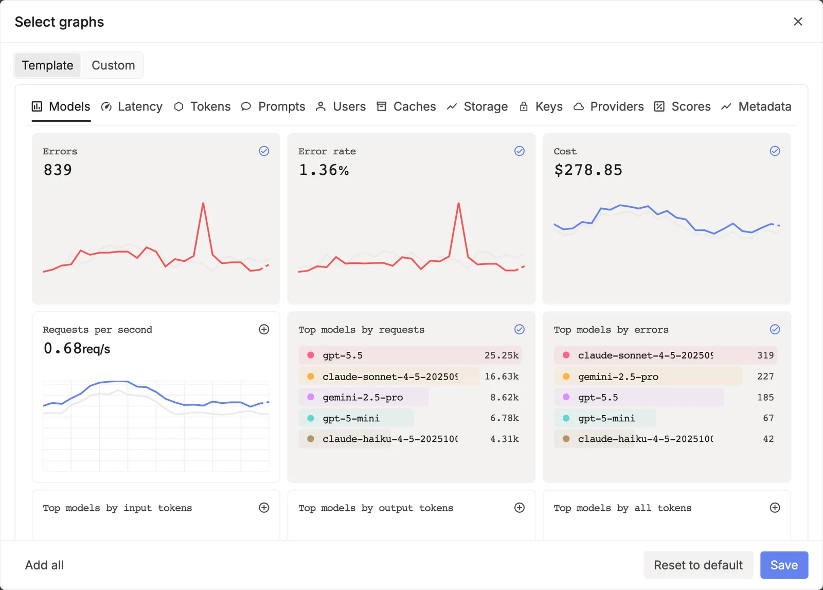
Browse Models, Latency, Tokens, Prompts, Users, Caches, Storage, Keys, Providers, and Scores.

3

Select graphs

Select one or more graph cards. Use Add all to select the available set or Reset to default to return to the standard selection.

4

Save the selection

Click Save to add the selected graphs to the dashboard.

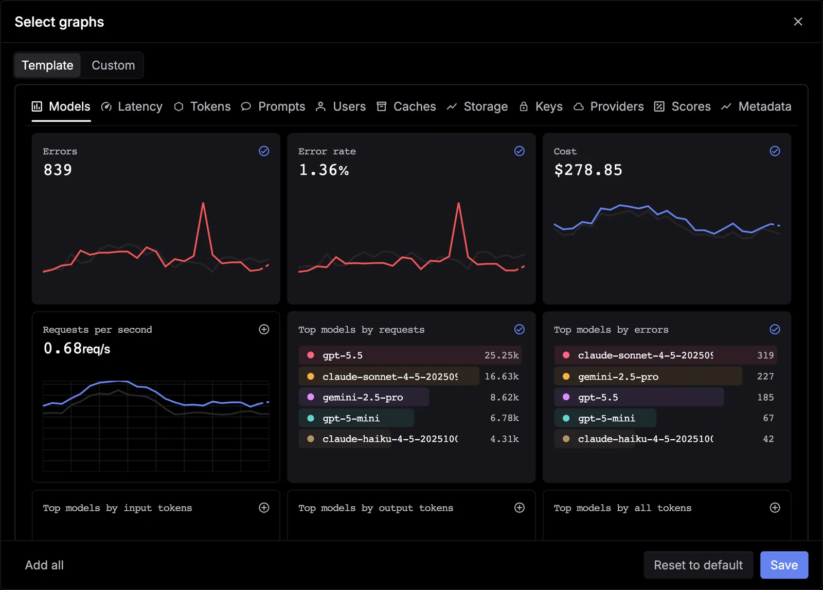
Respan graph template gallery with Models, Latency, Tokens, Prompts, Users, Caches, Storage, Keys, Providers, and Scores categories.
Start with a built-in graph organized by observability category.

Build a custom graph

Create a custom graph when a template does not answer the exact question you have. For example, build a P95 latency graph grouped by model to find which model is causing slow-tail performance.

1

Start a custom graph

Click New graph, switch to Custom, and give the chart a descriptive title.

2

Choose the metric and calculation

Select Latency, choose Percentile, and set the percentile to P95. Use the plus button to add another metric when a comparison belongs on the same chart.

3

Narrow this graph

Add Span filters when the chart should represent only a specific cohort. These filters are independent of the global dashboard filters.

4

Choose a grouping

Group the series by dimensions such as Model, Provider, or Customer ID. Avoid unnecessary high-cardinality grouping, which can make the chart difficult to read.

5

Check the preview and create

Confirm that the preview contains the expected data and units, then click Create.

Respan custom graph builder configured for P95 latency with title, metric, percentile, span-filter, group-by, preview, and Create controls visible.
Choose a metric, calculation, filters, and grouping, then verify the preview before creating the graph.

Choose the right percentile

PercentileBest for
P50Typical request performance
P95Slow-tail regressions that affect a meaningful group of users
P99Rare, severe latency outliers

Do not use an average alone for latency investigations; a small number of very slow requests can be hidden by otherwise fast traffic.

Customize chart display

Open Metrics settings in the toolbar when you need to change how the dashboard is drawn without changing which records it summarizes.

ControlWhat it changes
Compare modeAdds the preceding comparable period so you can distinguish a new change from the prior baseline.
Chart typeChanges the visual representation using the display types currently available in the menu.
X-axis major gridsShows or hides the major vertical grid lines.
Y-axis major gridsShows or hides the major horizontal grid lines.
Tick linesShows or hides tick marks that help align values with an axis.
Smooth graphDraws curved rather than straight line segments between recorded points.
Respan Metrics dashboard with the settings popover open, showing Compare mode, chart type, X-axis and Y-axis major grids, tick lines, and smooth graph controls.
Metrics settings change chart presentation; the time range and filters continue to determine the underlying data.

Grid, tick-line, smoothing, and chart-type controls are display settings. They do not change the time range, global filters, per-graph filters, aggregation, or source records.

Arrange and manage the dashboard

  • Drag graphs to put the most important signals first.
  • Resize a graph when labels, series, or breakdowns need more room.
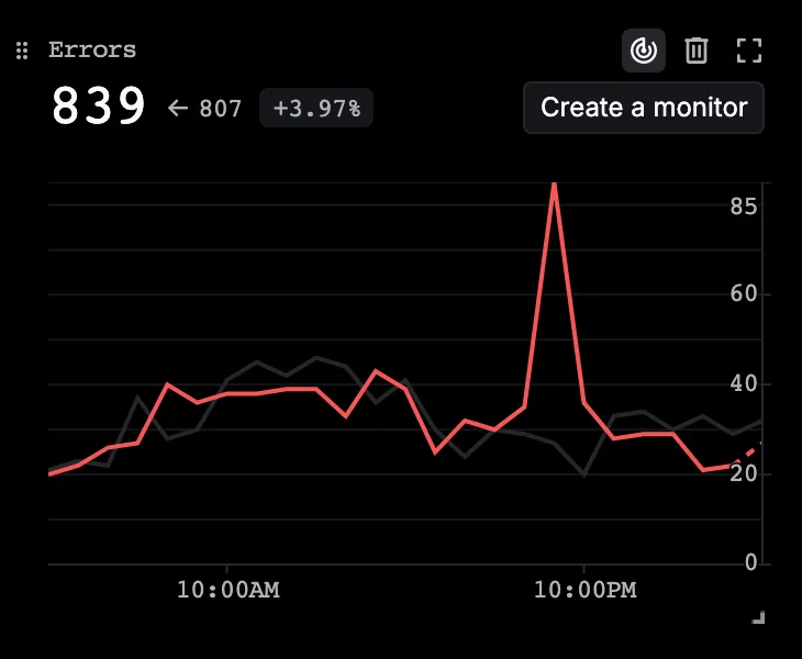
  • Use Expand chart when you need a closer look, and Remove chart when a graph no longer belongs in the current layout.
  • Use Reset chart layout to restore the layout after reordering, resizing, or removing graphs.
  • Use the refresh menu for manual or automatic updates.
  • Use the export control in the upper-right toolbar when you need an offline copy of the current dashboard.

Investigation workflows

Diagnose an error spike

  1. Set a range that includes the spike and a small amount of time before it.
  2. Compare Errors with Error rate. A higher error count with a stable rate can simply reflect higher traffic.
  3. Check Top models by errors, then filter to the suspected model or provider.
  4. Open Errors and apply the same time range and filters to identify the main incident and error group.
  5. Open Traces and inspect the trace hierarchy to find the first failing span and its input, output, and error details.

Explain a cost increase

  1. Confirm the increase in Cost and Requests.
  2. Filter by model, provider, API key, customer, or a cost-related custom property.
  3. Add a cost graph grouped by the dimension you want to compare.
  4. Open Spans for individual model calls or Traces for the full workflow behind a costly request.

Find a latency regression

  1. Compare P50 with P95 or P99 to distinguish a broad slowdown from tail latency.
  2. Compare Latency with TTFT. High TTFT points to time before the first token; high total latency with normal TTFT points to generation or downstream work.
  3. Group latency by model or provider.
  4. Apply the same cohort and time window in Traces, then inspect duration bars to find the slow span.

Dashboard, Logs, Traces, or Monitors?

UseWhen you need to
Metrics dashboardSee an aggregate trend or compare cohorts
LogsInspect one model request and its recorded fields
TracesUnderstand the complete multi-step execution and nested spans
MonitorsEvaluate a metric continuously and notify a destination when a threshold is crossed

After you know which signal matters, create a monitor so you do not need to watch the dashboard manually.

Troubleshooting

The dashboard has no data

  1. Widen the time range.
  2. Clear global filters and check any per-graph Span filters.
  3. Confirm that you are in the intended project and environment.
  4. Check whether recent records appear in Spans or Traces.
  5. If neither page contains data, follow the Tracing quickstart and send a test trace.

Cost is zero or unexpectedly low

Check whether the recorded model name maps to a configured model with pricing. For aliases and newly released models, review Providers and models.

A user or customer breakdown is missing

Confirm that requests include a customer_identifier. See Customer identifiers.

Dashboard and trace counts do not match

This can be expected: the dashboard counts request-level records, while Traces counts root executions. Also compare the time range, environment, global filters, and custom graph filters on both pages.


Need help?

Join our Discord — we’ll help you investigate your metrics.